Windows 11
With the new windows 11 event right around the corner, many leaks have surfaced over the internet. One can find a developer edition of Windows 11 anywhere online. I compiled some of the features from one such edition. Windows 11 will be officially announced on June 24th.
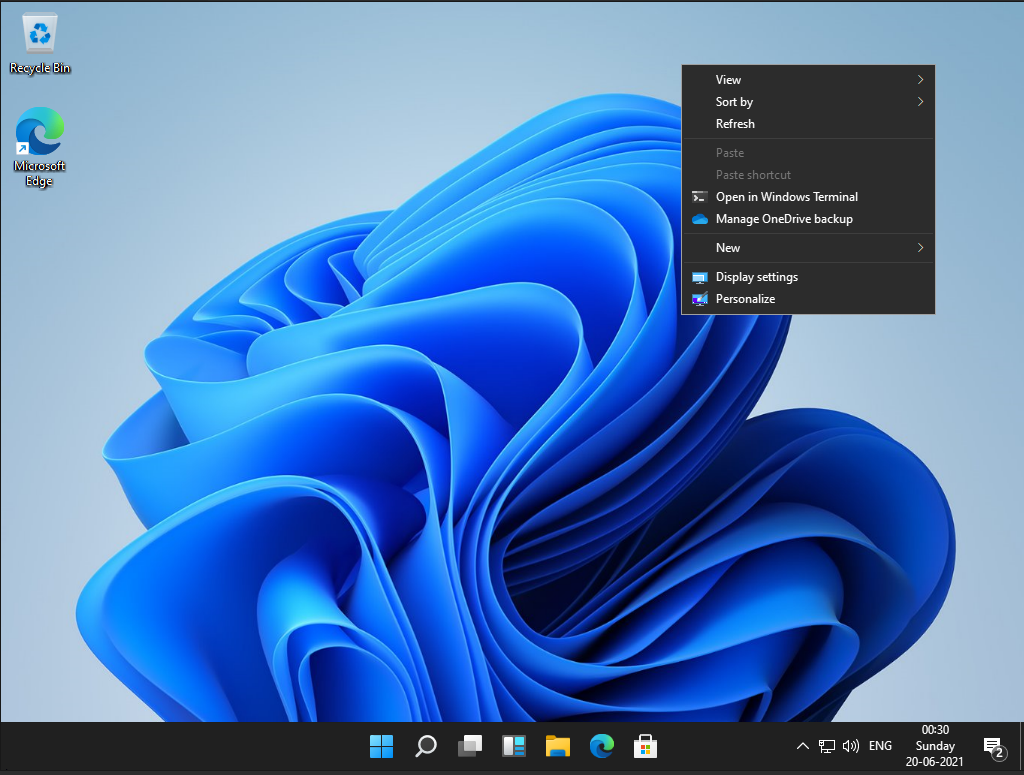
Right off the bat, you will notice the sleek new design of the OS. Although the design is not entirely overhauled, subtle animation and design changes give windows 11 a refreshed new look.
Taskbar and Start Menu
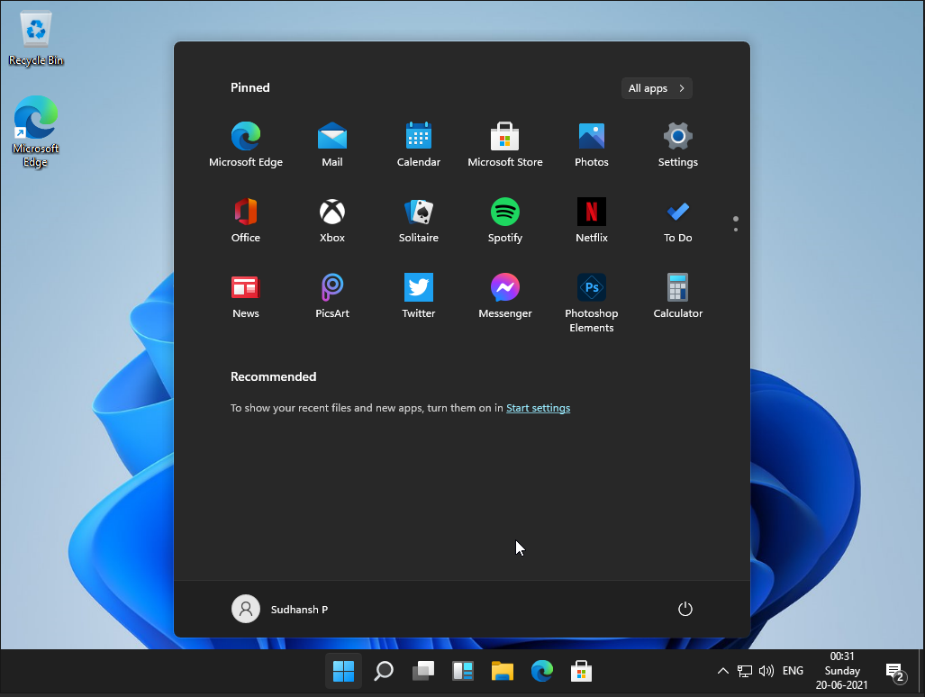
The new centered layout of the taskbar is the first thing that one notices that’s new in Windows 11. The last time Microsoft made a significant change to the start menu (yes, I’m talking about Windows 8), it faced discontent from the users and critics alike. However, this time around, the primary functionality of the start menu is the same, and the design has changed outstandingly.
The design pretty much looks like the deprecated OS, windows 10X. Microsoft had been working on an operating system for dual-screen devices before cancelling this project. The central arrangement of the taskbar is reminiscent of the macOS dock. I, for one, prefer the original taskbar alignment.
You can revert back to the left alignment of the taskbar in settings. In addition, the taskbar has refreshed icons, a new start button and menu, and on-click animations to the buttons.

There are some major changes to the Start menu in Windows 11. Previously, it contained a long list of apps with live tiles (a beloved feature from Windows 8). Microsoft does away with this layout and replaces it with pinned and recommended apps. Therefore, the start menu now looks much simpler and easier to use. In addition, the start menu hovers over the taskbar and has rounded corners (again, something abundantly found in macOS).
Search
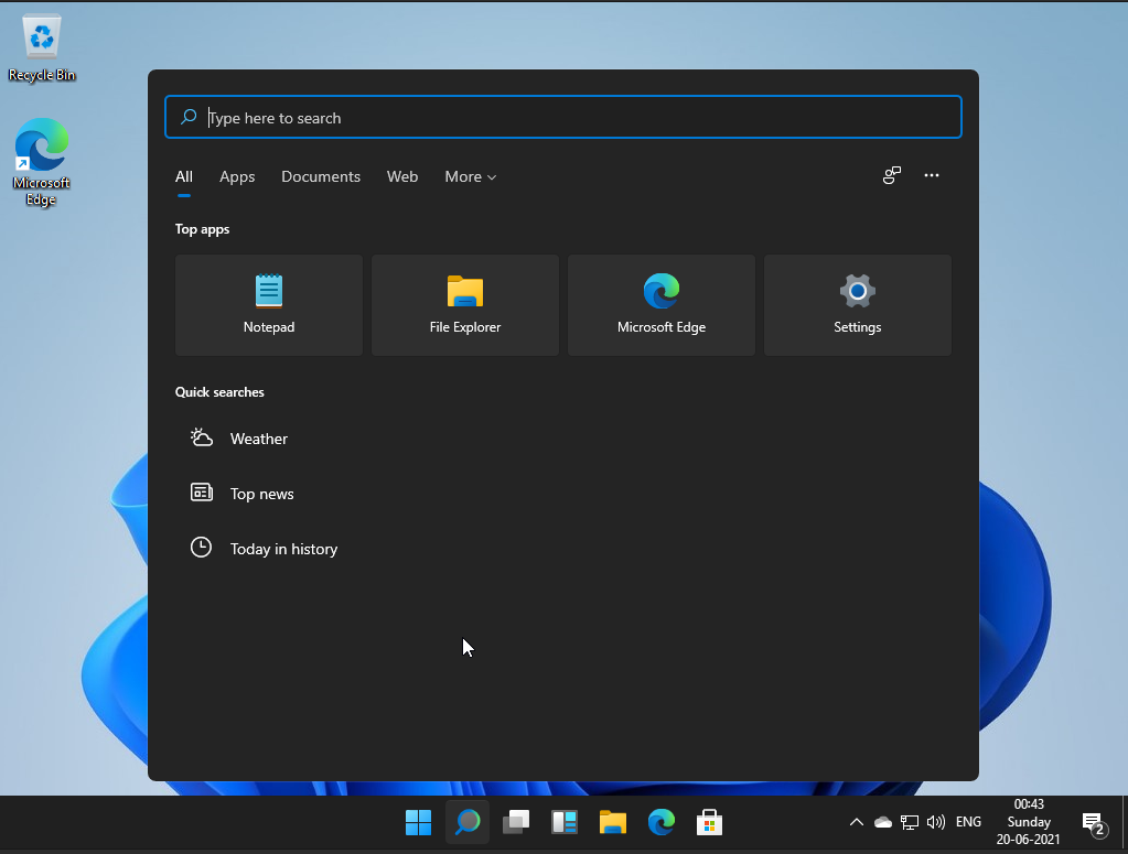
This developer version of Windows 11 does not have Cortana. According to some recent articles, Cortana denies the existence of Windows 11! There aren’t any significant changes to the search interface other than the design. It has a similar ‘hover’ and ‘rounded corners’ like the start menu.
Widgets
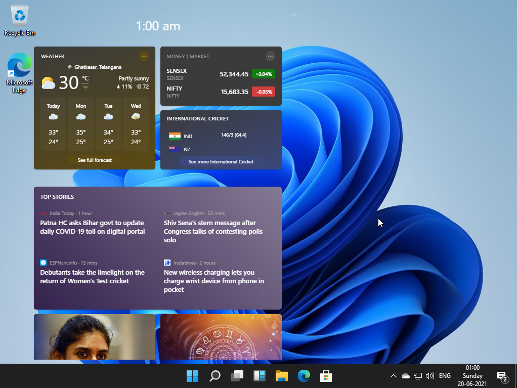
The new icon to the left of the file explorer on the taskbar is “Widgets”. Widgets are making a return from Windows Vista but with a much more cleaner interface. Similar to iOS, the widgets are arranged in tiles, and each tile gives look-at-glance updates and information.
Multitasking and virtual desktops
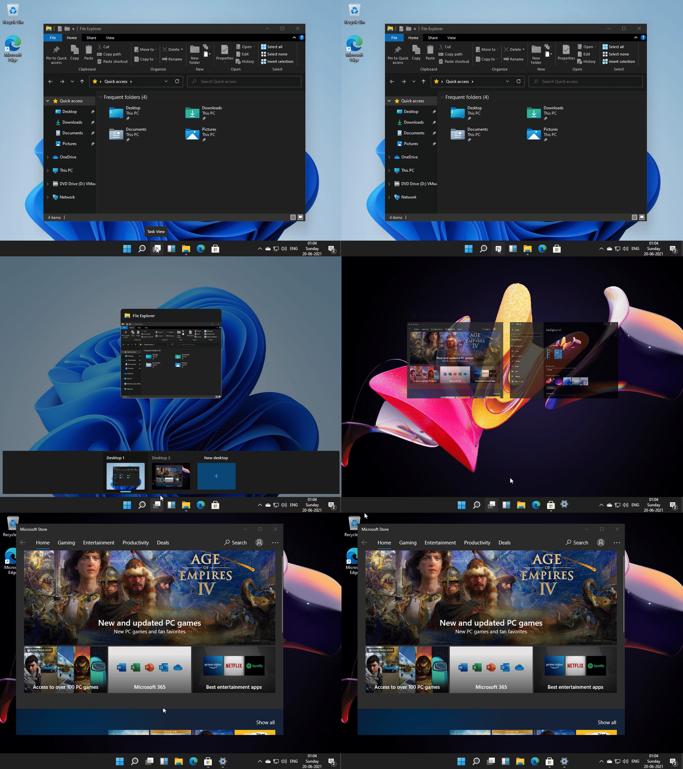
Using virtual desktops is much more natural in Windows 11. You can change individual desktops’ backgrounds and slide through the different desktops using touch and mouse.
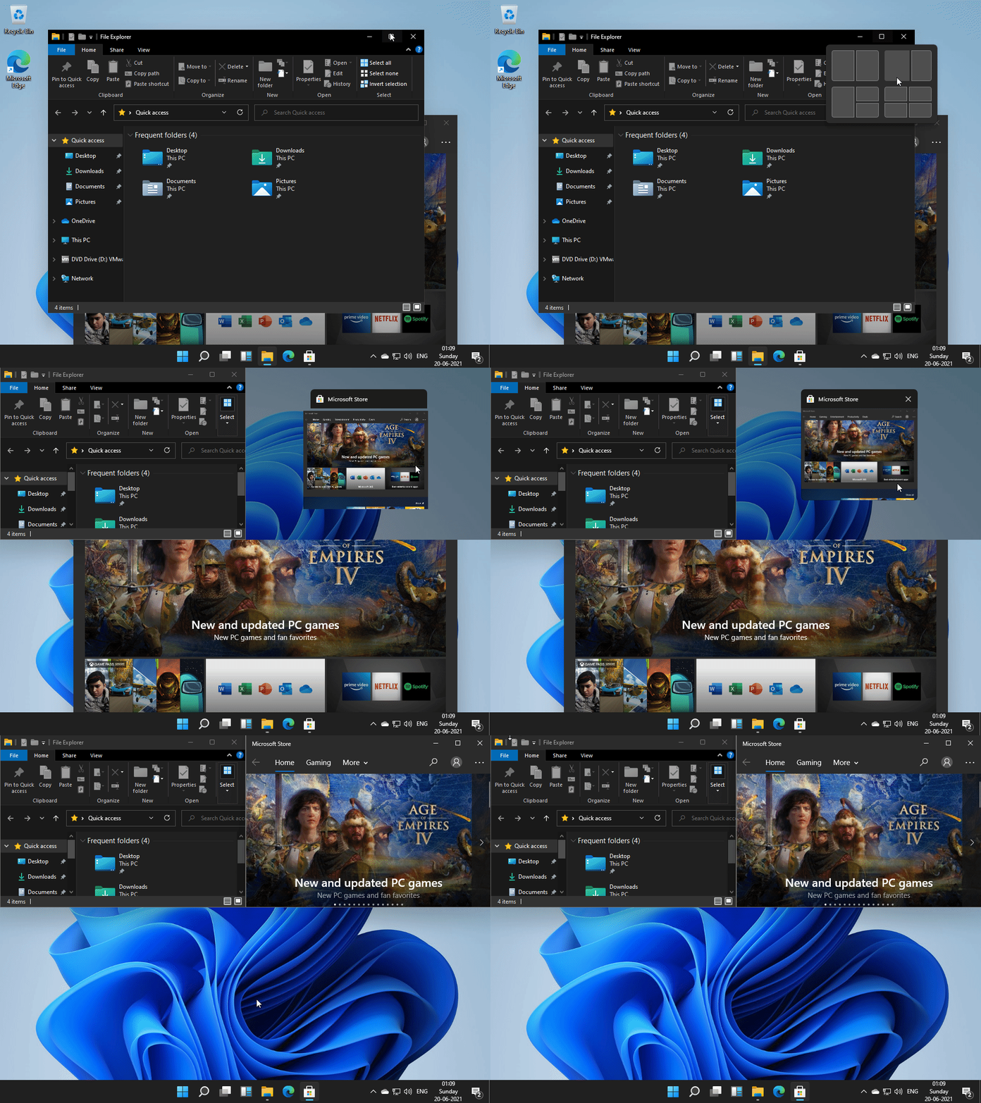
Multitasking gets a whole lot better on Windows 11. Many users work on multiple tasks using ‘split-view’ on Windows. Microsoft makes it easy to work with multiple windows using the new “groups” feature. When you hover over the maximize button of a window, you will notice 4 layouts to arrange multiple windows. You can create a group of windows, and Windows will remember that for later use.
Action Menu
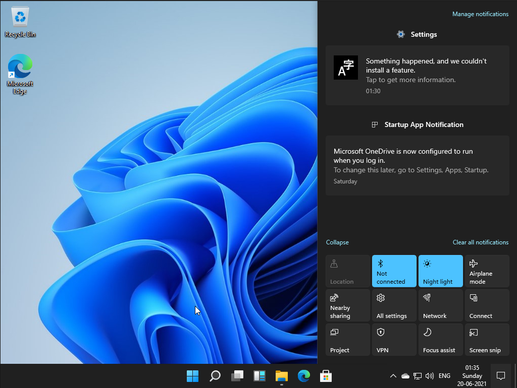
The action menu has a consistent rounded-corners design. It has more prominent icons and bigger slider icons. This does not look like a big change for non-touch users, but it’s invigorating for touch users. The buttons and other options feel right at the fingertips in the new design.
Animations and Aero Theme
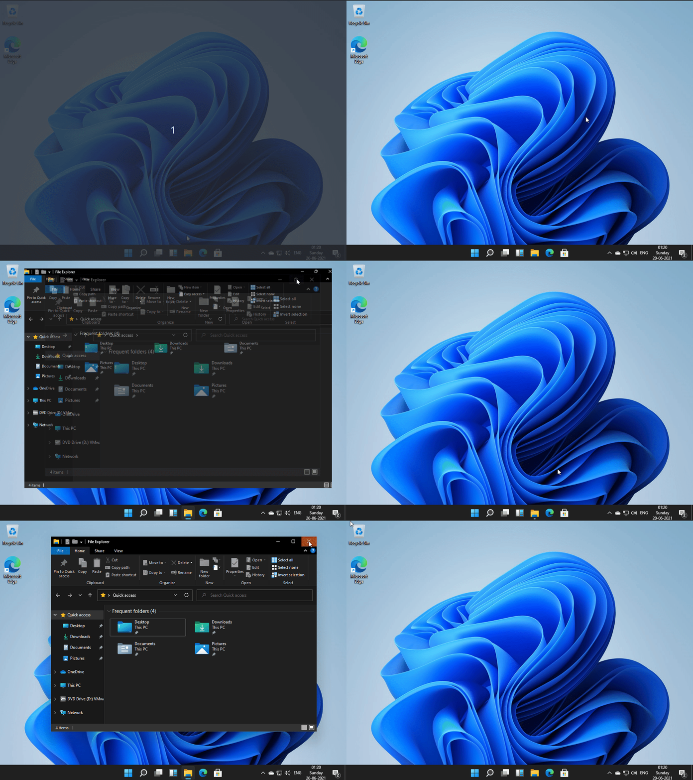
Windows Vista and Windows 7 sported the Aero theme, giving a glass-like effect to windows and fancy effects to tiled apps. Microsoft dampened these effects in Windows 10, but they’re back in Windows 11. Windows 11 has much smoother animations. For example, when you drag a window to an edge or a corner, a gray/glass-like background shows the new layout of the window.
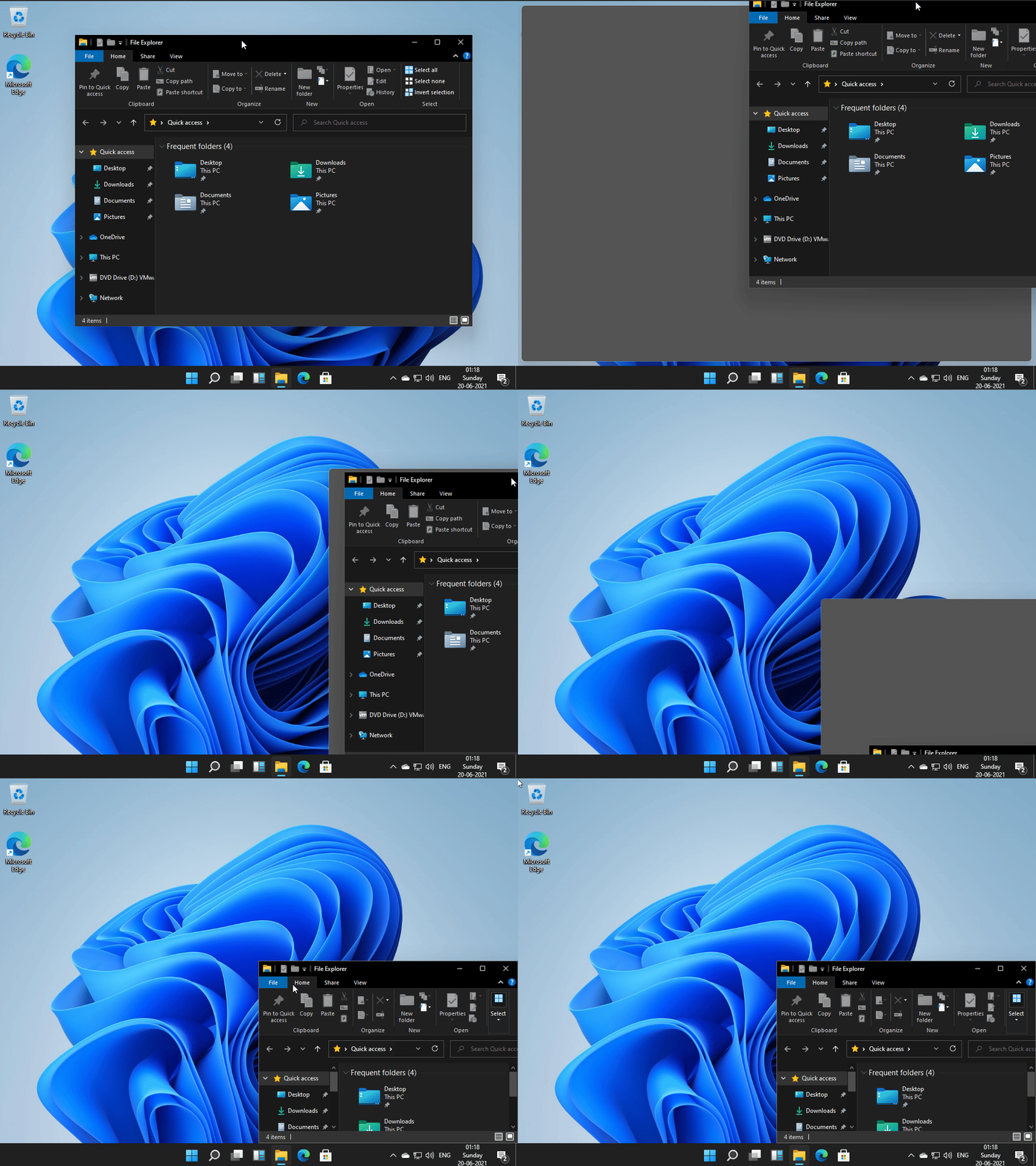
The window transitions for minimize, maximize, close and open animations are also beautiful. The taskbar icons bounce when the window is minimized. All of these give the new Windows a contemporary look.
Sounds
Windows 11 has a new set of sounds for frequently used tasks such as inserting USB drives, notifications, error messages, and more. Most of these sounds stayed pretty much the same in Windows 10, and it’s refreshing to hear new sounds in Windows 11.
File Explorer
As you might have noticed, the file explorer looks very different from the previous iterations. The icons have a colorful new look, and they look even better in the new dark mode.
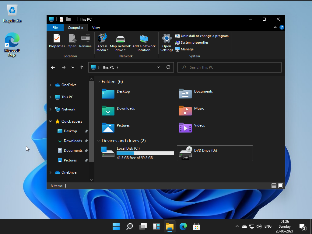
Most of these icons remained the same across all the operating systems till Windows 10. The new icons further help Microsoft develop a modern look for the new OS. There are new icons for Documents, Videos, Pictures, Downloads, and much more, which you will notice as you browse around.
Conclusion
Microsoft is entering a new era with Windows 11. The developer version has limited features and quite many bugs. Nonetheless, tons of new features will be announced during the official release. Overall, the OS has a refreshing feel and promises a brand-new experience compared to Windows 10.
Enjoy Reading This Article?
Here are some more articles you might like to read next: